|
12/6/2017 0 Comments "lakeside rewind" logoThe reason why we created the logo like this is because it really describes the characteristics of the festival very well. The theme of our festival is Early 2000's Rock music. With it being 2017, we thought it was a good idea to incorporate the word "rewind" since you are rewinding into the past. The shape of our logo is the shape of a rewind button. Since the festival takes place in Chicago, IL we thought it was important to incorporate that aspect, so we made the left end of the rewind button into a city building. We wanted to keep the logo simple, yet very effective so people will be able to correlate the logo to the festival. The way we created the logo was through Photoshop. We decided it was a good idea to keep the logo black, because if we ever needed to change it based on certain merchandise for the festival, it wouldn't be a drastic change. We thought the font fit the logo because when you hear the word lakeside and rewind it flows together in unison with each other so a flow like font was definitely needed for the logo. This is very effective in our marketing plan because it will allow people to recognize the type of music that is being demonstrated throughout the music festival. You are going through time and listening to music that was most popular in the early 2000's. It is easily identifiable to where people will recognize where the logo comes from. The theme it follows is that all of our marketing components are very simple, yet unique in their own way. They aren't overloaded with information, but they have just enough so you are able to identify Lakeside Rewind with the products.
0 Comments
12/6/2017 0 Comments poster The poster that we created is very important when marketing the music festival. This is what gathers an individuals attention and draws them to the festival. The way that we created this poster was through Photoshop. Through Photoshop we were able to distort figures and text the way that we wanted it to provide the perfect look and vibe for our festival. We were able to incorporate all the important elements that it needed to make an effective poster. We used the light tie dye in the background to keep up with the constant tie dye theme throughout all promotional products. it is light enough to where it is identifiable, but now too distracting that you cannot read the other text that is being displayed. The font that we used to display the different artists that are being displayed is contrasting the other font in the logo. This makes the logo stand out, and the artists. If it was one font then nothing would catch a person's eye, making the poster ineffective. A technique that I used creating this poster was the form the font with the poster to make it flow. I curved the text in a way to make the poster look visually appealing and display all the artists that will be in attendance of the festival. We made sure to include the different sponsors in the poster. The sponsors that we chose were at&t and red bull. These both reach the target market because everyone is connected some way to phones and tablets, and red bull is a very common drink within that age range. This is very effective because it fits the theme of our marketing plan. To keep things simple, yet very appealing to the person's eye. The tie dye will allow the person to recognize where the poster is coming from along with the logo. The guitar puts the poster into perspective of what type of music is going to be played at the festival without really sharing the genre. It speaks to the older generation and the younger generation. It is just modern enough to where both target markets will be attracted to the poster no matter where they are.
Something that I would like you to know about this poster is that I put a lot of work and effort into this product. It was really important to get all the artists names in with the correct font, as well getting the right background. I played around with the format of the text to make sure the poster was visually appealing. I warped and distorted the text in a way that would make the poster flow well. I made sure to incorporate all the elements a poster needs to have in order to be effective. This allows the poster to catch many people's attention. Also, lots of people want to be able to see all the artists that will be at the festival in one place. I made sure to put the headliners bigger at the top, and then the less popular bands at the bottom. This way people know who they are seeing and who is supposed to be the most popular. 12/6/2017 0 Comments festival tickets
For the tickets we decided it was the best idea to create wristbands. At festivals, there are thousands and thousands of other people in attendance. It's very easy to get caught up in the chaos of it all and lose your belongings. The last thing that you want to misplace is your ticket into the festival. With a wristband you don't have to worry about that. It fits tightly on your wrist so while you're rocking out to your favorite band you don't have to be cautious about losing your ticket. I created this item in Photoshop because in the beginning the wristband was just plain black and I needed to add an identifiable aspect of Lakeside Rewind to it. I made sure to change the wristband color to a tie dye to fit the theme of the festival and allows the people to feel fun while they're wearing it. A ticket is something that a person keeps in order to remember a time in their life. You want Lakeside Rewind to be easily identifiable so they are able to look at the wristband and remember the amazing time that they had. We used the same font that we did in all the other products to keep the theme because then it is consistent and recognizable. This fits effectively into the target market because it is the new style these days with the festivals. At this point in time millennials and other people want everything to be as easy as possible. With a wristband, it allows the festival go'er to be flashy as well as responsible with their ticket. Also, the people that are going to be attending the festival are going to have a little edge to them based on the music that they listen to. This wristband is the perfect amount of modernization with rock.
12/6/2017 0 Comments BACKSTAGE PASS With the backstage pass we wanted to make it bold and bright because it is an exciting time when a person gets to go backstage to see their favorite bands! It's different than the wristband tickets that we have for all the general admission tickets. We wanted to make sure that the font stayed consistent with the theme of the marketing plan because it matches the poster, tshirt, and other tickets. It's just rock and modern enough for a person to feel cool walking around with it. The technique that we used to create the backstage pass was Photoshop because we were really able to add the elements that we wanted to into this backstage pass. We were able to implement our tie dye background, the correct font, and our logo all in one canvas. It hits the target market because anyone in this time period wants something they can keep forever as a memory. Whether an adult or a millennial purchases the backstage pass they will value it with pride because they have something to remember the festival by. It also reaches the target market because of the phrase "VIP Guest". Everyone likes to feel like they are special and VIP at some point of their lives. By wearing this badge around their neck they will feel like they are "cool" which is a huge part of today's society.
12/6/2017 0 Comments PROMOTIONAL GIVEAWAY For our promotional product we decided to give away a portable charger. With this portable charger people will be dying to win this prize. At music festivals, your phone is constantly dying. You don't want to be recording your favorite band and then your phone suddenly dies! Lakeside Rewind is here to save you. The way we created the portable charger was through Photoshop. We got a template off of Google Images and decided to put a twist to it by adding the tie dye and our logo. We wanted to keep the theme of the tie dye going so it is easily recognizable with our festival. This product fits with our marketing plan because it is something that is going to attract people, especially the millennials. It's something a person is actually going to use, and possibly use it at the festival itself. It's something that a person values and does not want to just throw away once they immediately receive it. They are going to be walking around the festival with it, which will draw people's attention to the logo and the tie dye, easily matching it with Lakeside Rewind.
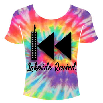
12/5/2017 0 Comments TSHIRTThis is the tshirt that we made for the music festival. We made it by using both Photoshop and CustomInk to produce the best product for this festival. We chose a tie dye color because we thought it would show the exciting,fun vibe of the festival. We put our logo on the shirt with the festival name so it is easily recognizable and identified with our festival. The theme that we are portraying is the tie dye because throughout all the promotional aspects we have included the tie dye. We also have a white option for whomever wants the more simple side of their clothing. The technique that we used was to go to CustomInk.com to create the best shirt possible for the festival. This item fits our target market perfectly because it really hits the millennials and adults that we are trying to reach. The millennials whom are more vibrant can look for the tie dye shirt for their wardrobe, but the adults who attend who want a more casual look can pick the white version. The theme that we wanted to follow was that rock vibe, but also put a modern twist on it with our logo and the tie dye option. I would just like to highlight that about this product we made sure to make two separate ones to fit our target market. We could've just made one simple one for everyone. But we decided to add a variety for certain people's tastes.
|
AuthorWrite something about yourself. No need to be fancy, just an overview. ArchivesCategories |


 RSS Feed
